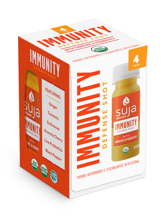
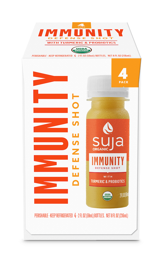
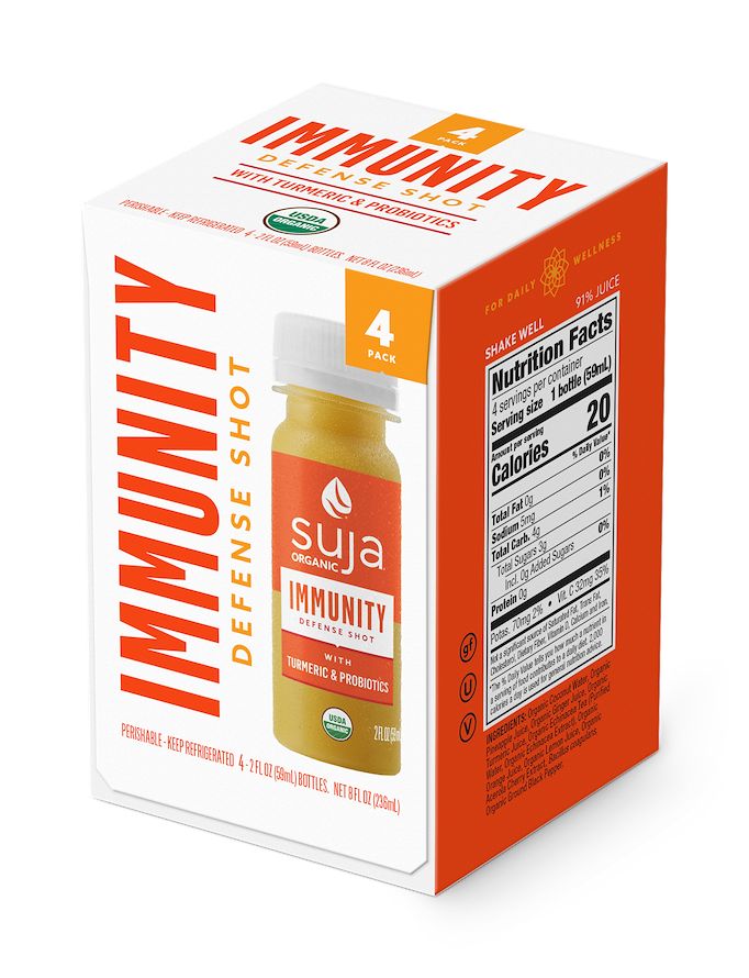
SUJA
COLD-PRESSED JUICE
PACKAGING
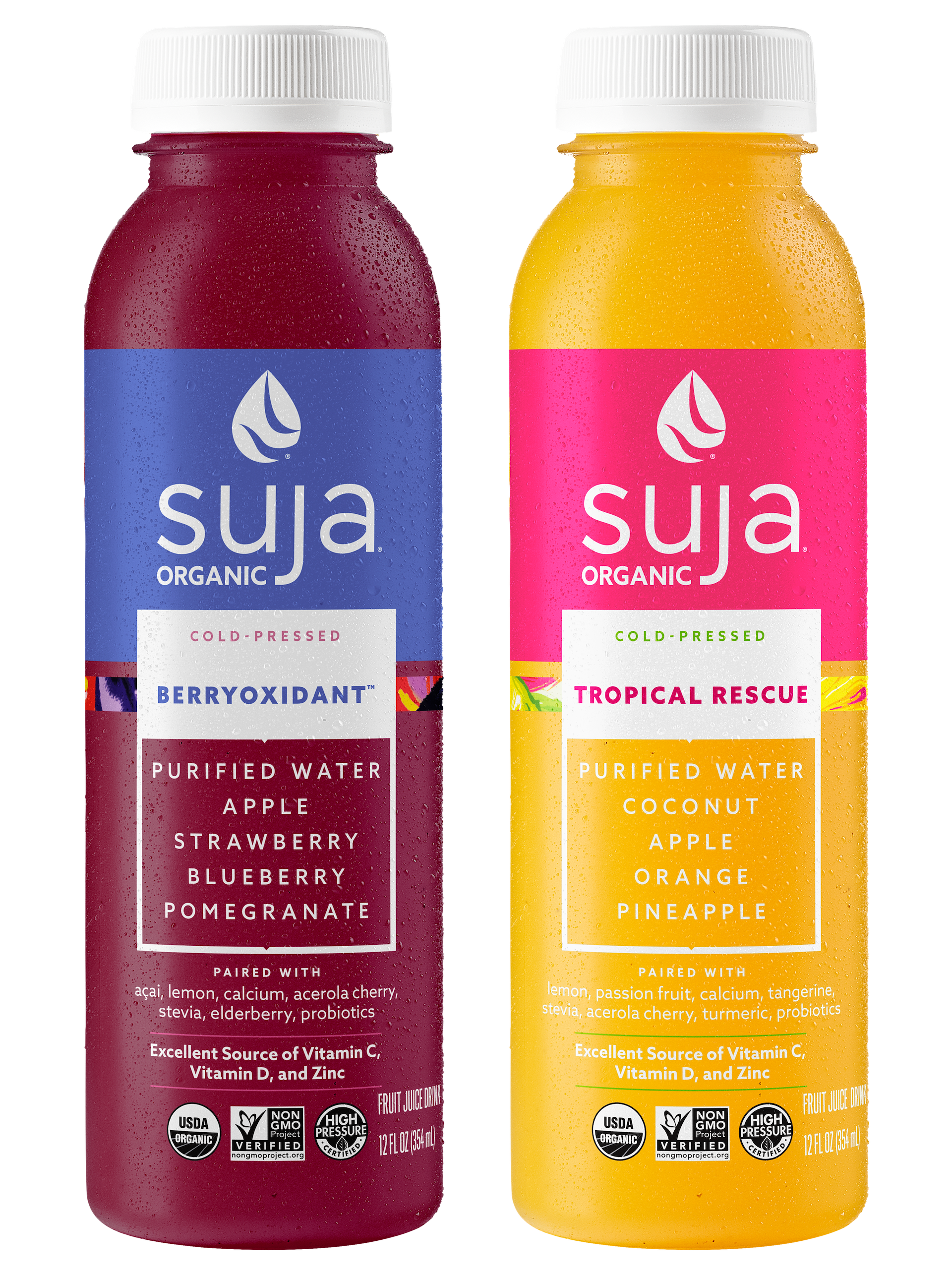
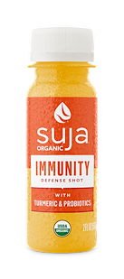
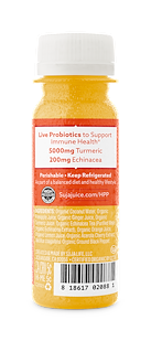
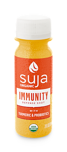
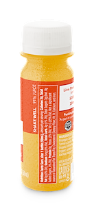
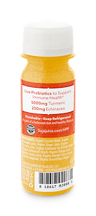
The client requested art for new SKUs within an existing product line. I selected Pantone colors, created new illustration bands which live below the main color block and laid everything out with the given specifications. It was important to keep the brands existing presence in mind to ensure each product remained distinct.
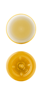
PRODUCT RENDERINGS
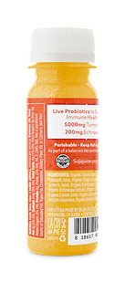
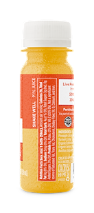
Renders of product in various angles to showcase on web and e-commerce platforms. I have created renders for products in a multitude of formats by client request but also to ensure the design is sound and functional.


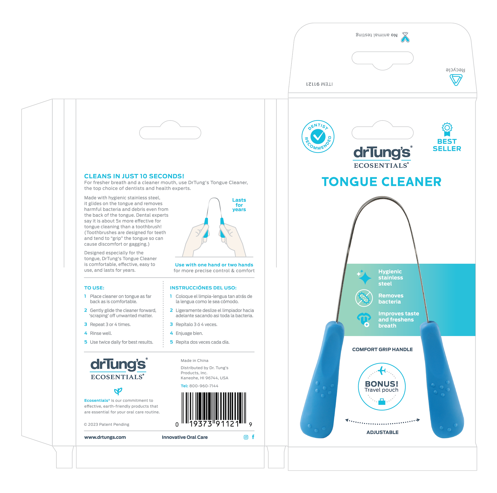
DR.TUNGS
TONGUE CLEANER
PACKAGING
This was a multifaceted project as there are 4 different colors of the product and it was requested there be a English/Spanish version as well as an English/French version for each. I created the layout, designed the icons that pair with the specs in the center and photographed the product.
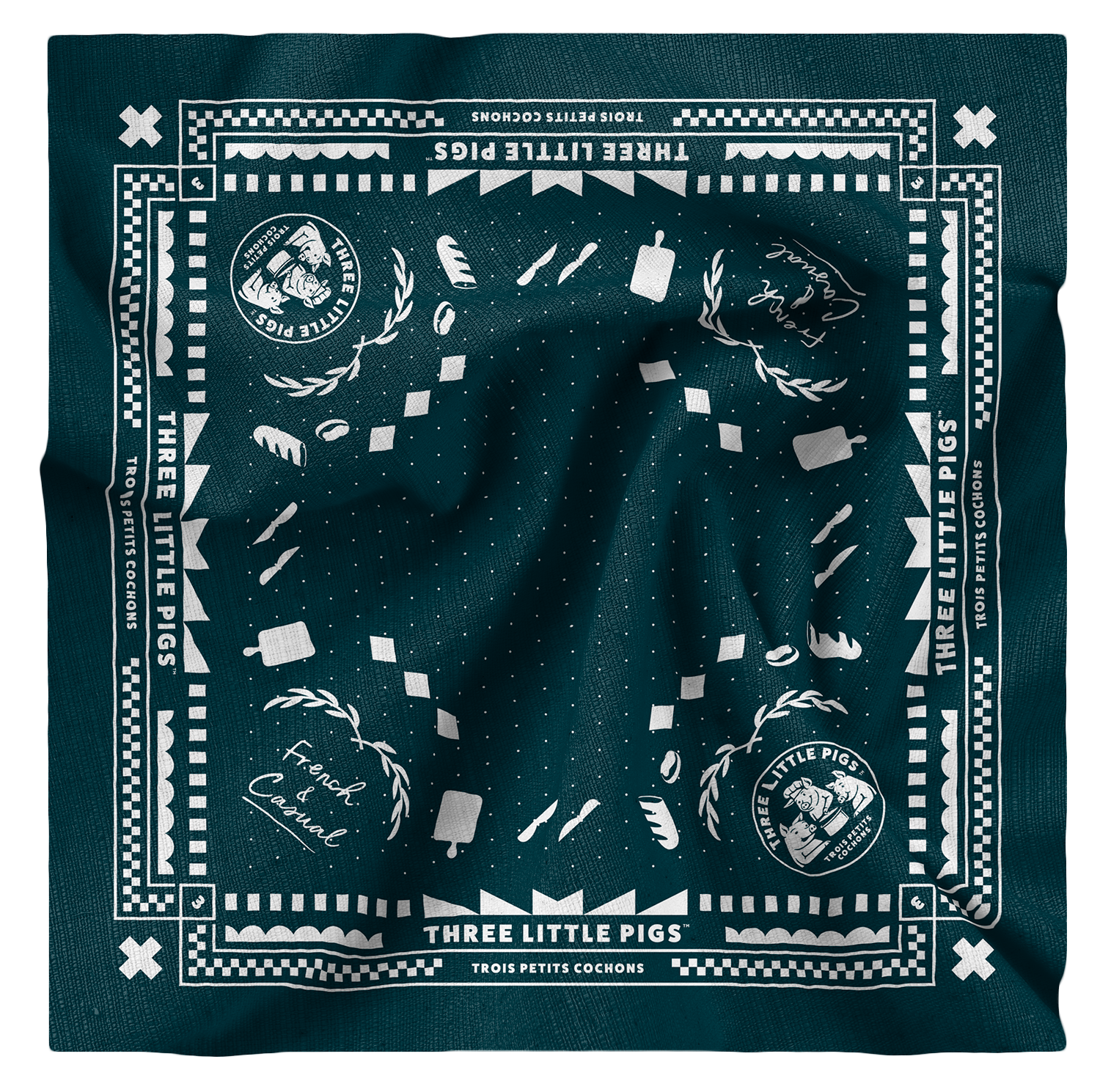
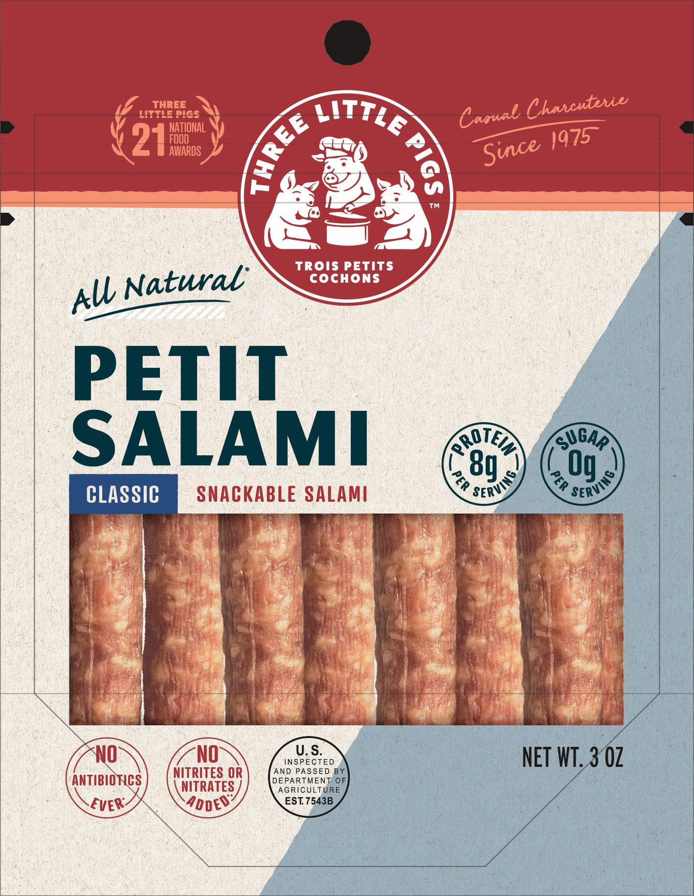
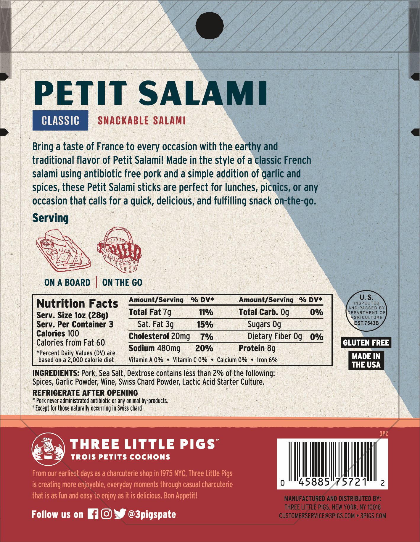
THREE LITTLE PIGS
SWAG
Bandana I designed utilizing brand relevant elements for the client’s internal use. I learned a lot in regards to file set up and how to ensure everything remained truly symmetrical while creating this.
PETIT SALAMI
PACKAGING
Packaging laid out using the clients new branding. I knew there were certain things I needed to retain such as the red brand block, general type treatment and icon usage but needed to solve for unique SKU specifications and consider how the line might extend if other variations came to exist.
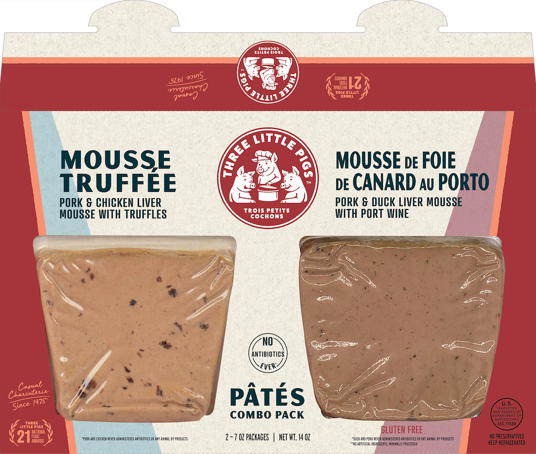
MOUSSE COMBO
PACKAGING
This was a new product in which 2 existing SKUs would be sold as a combo. Some challenges I faced were SKU names differing in size, retaining the look and feel of existing Pâté packaging while introducing a completely new concept and keeping the information separate yet easy to digest.
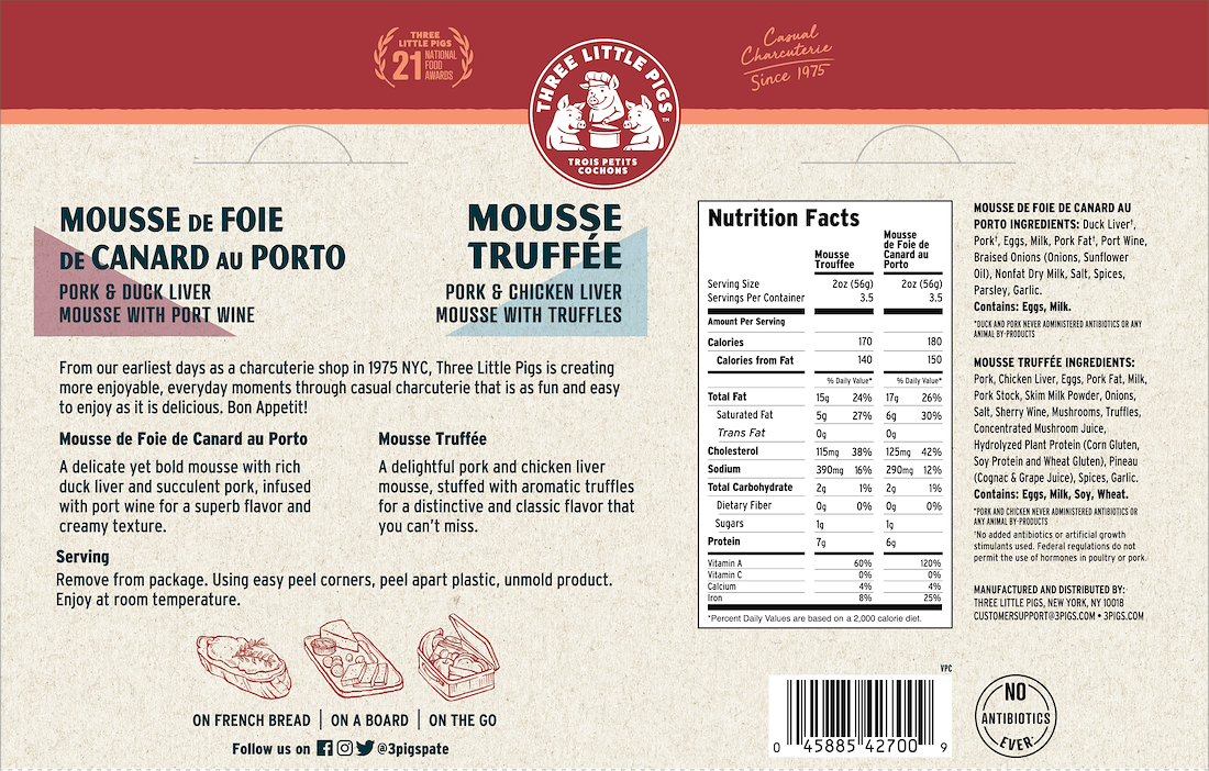
BACK
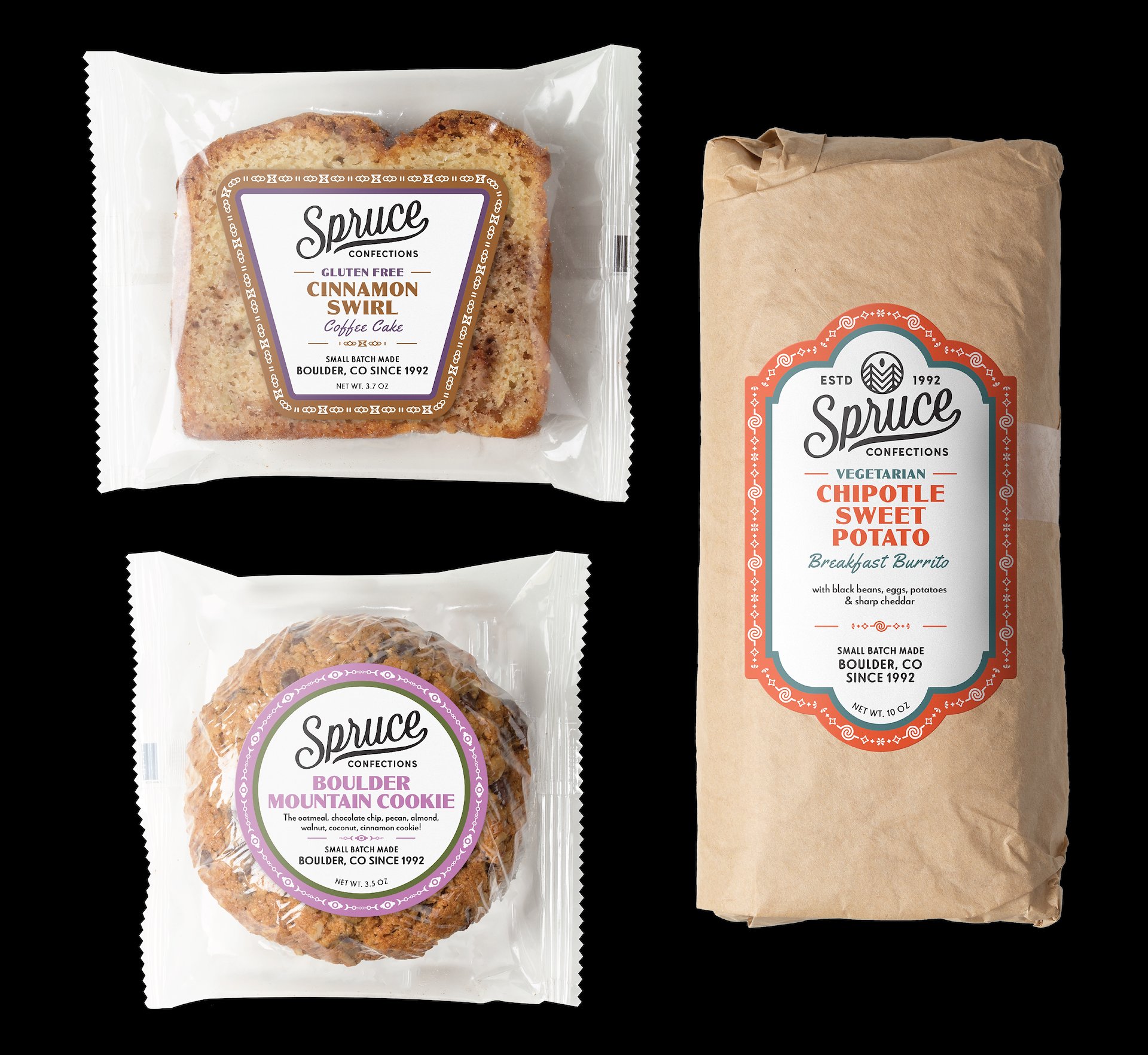
SPRUCE
CONFECTIONS
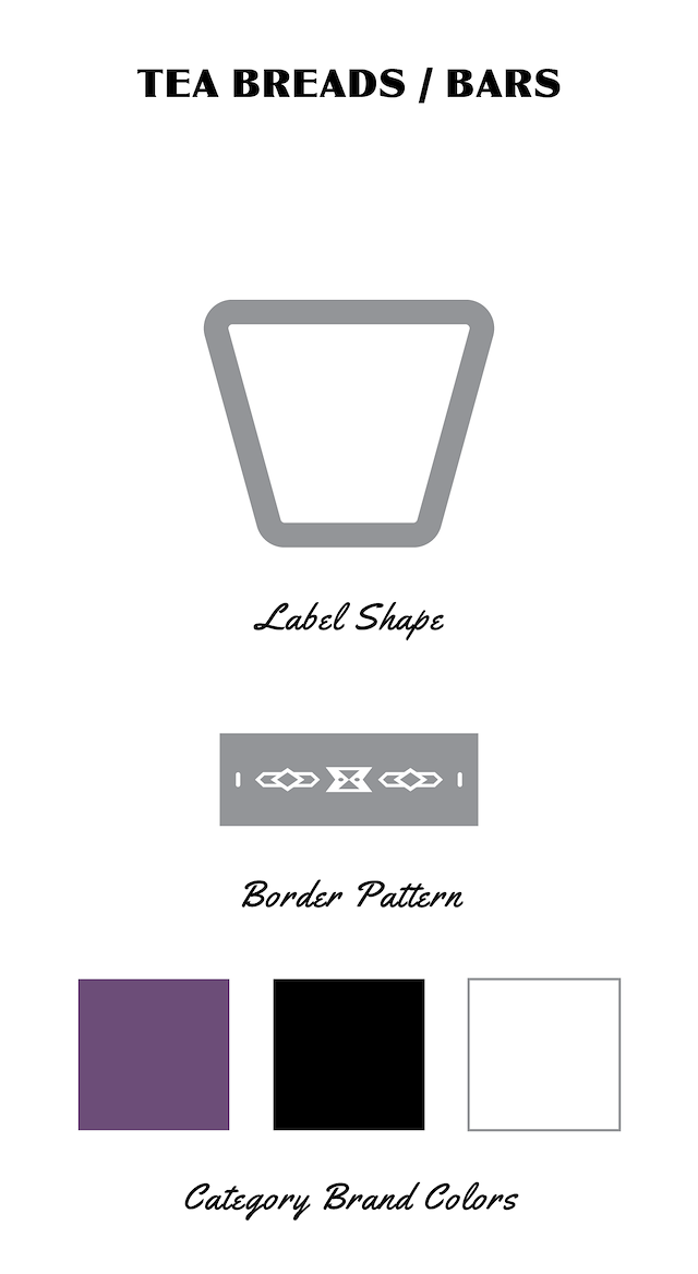
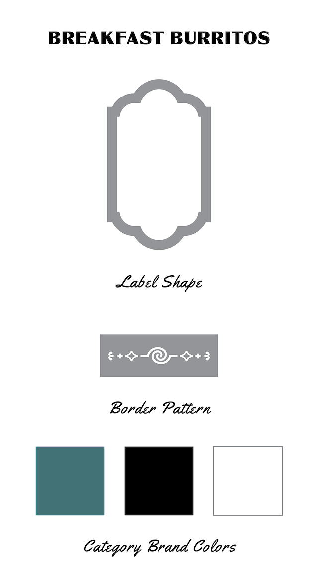
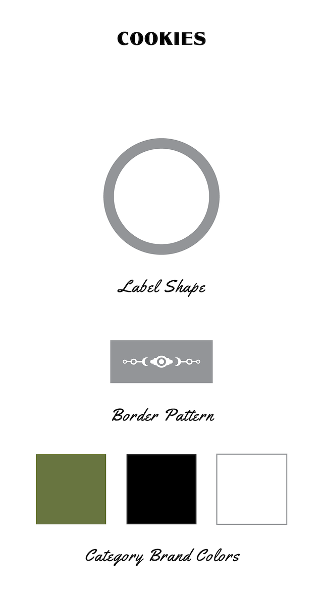
BRAND REFRESH
This is a concept for a brand refresh I created that was not selected by the client. The ask was to give the brand a face lift while developing an easily extendable graphic system to help organize and clearly market the wide breadth of products they sell.
My thought was to create a unique patterned border for each line and use colors to distinguish flavor. The blockier squared off pattern on the coffee cake inspired by the loaf shape of the product, the swirls on the burrito border mimic the roll up of the tortilla and a circular situation for the cookie pattern